RESEARCH / UI DESIGN / WIREFRAMING / PROTOTYPIING
CASE STUDY

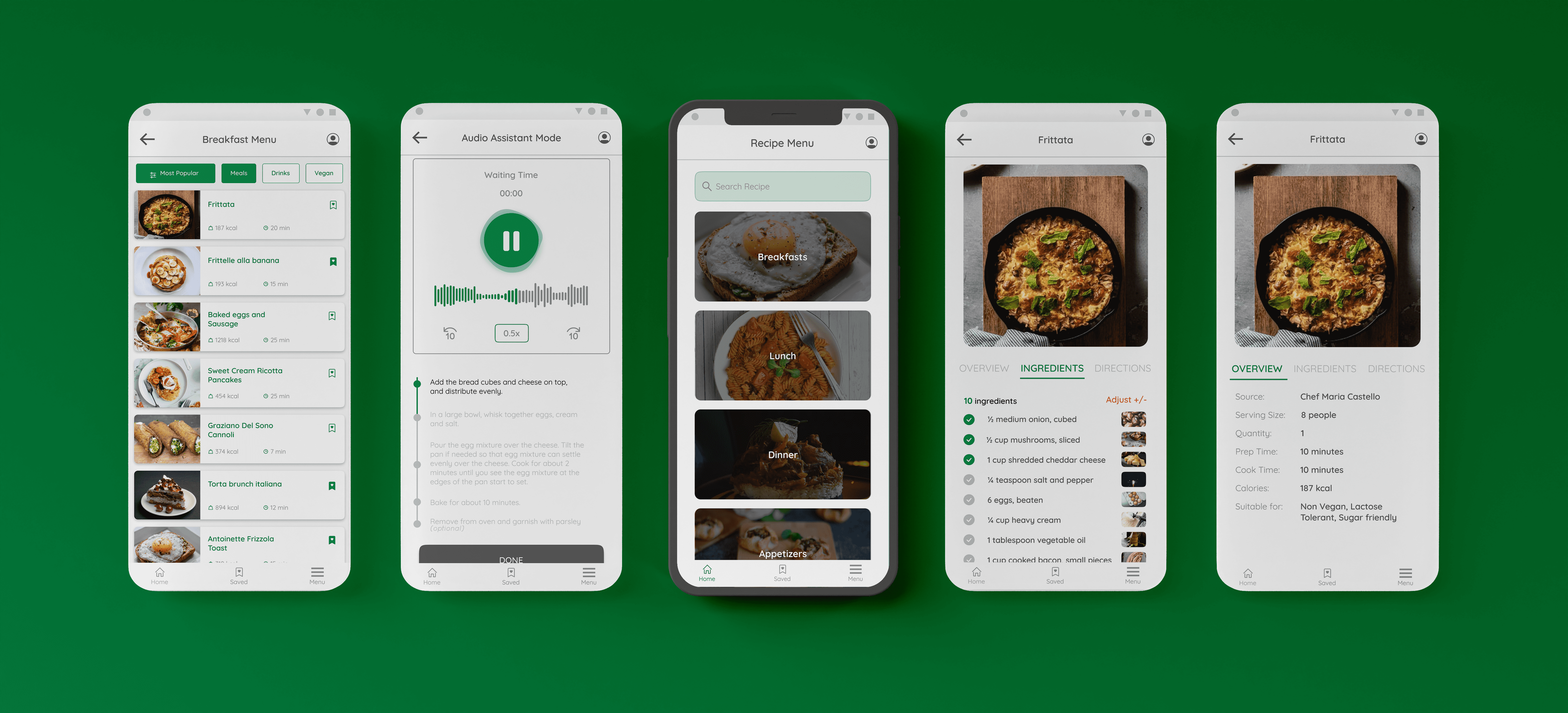
I designed a recipe app for an Italian restaurant that helps increase kitchen productivity and helps the Kitchen staff stay creative and updated with the restaurant’s recipe. It has two unique features; a time-synced audio assistant and recipe ingredients calculator. The full prototype is available here
Sole designer from conception to delivery. Conducted research and interviews, created paper and digital wireframes, low and high-fidelity prototypes, conducted usability studies, accounted for accessibility, iterated on designs, determined information architecture, and designed final layouts.
November 2021 to January 2022 (7 weeks)
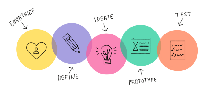
La Ciotola (meaning the bowl in Italian) is a recipe app for a restaurant that offers a wide multicultural variety of dishes. The aim of this project is to deliver valuable features to the users that would help fuel their creativity in the kitchen daily. I decided to use a user-centered design method to focus on persona creation and user goals for this project. The MVP for this product is a mobile application.
I started with secondary research (articles and videos) to understand what life is like in a restaurant’s kitchen and to have answers to some questions like:
From articles and videos, I learned some of the answers to the questions highlighted above; it helped zero in on the project goals, and I proceeded to user research.

From the research conducted, I learned there is no digital solution for
onboarding new staff or keeping track of recipe changes from the interview. I learned
BOH staff are a bit unreceptive towards a digital recipe organizer or use of devices
in the kitchen at all. However, participants mentioned consulting recipe books/journals at least once.
Analyzing the interview feedbacks and mapping user problems, I was able to recognize some user pain points

To further empathize and get to understand the users better,
I created user personas to guide my design decisions

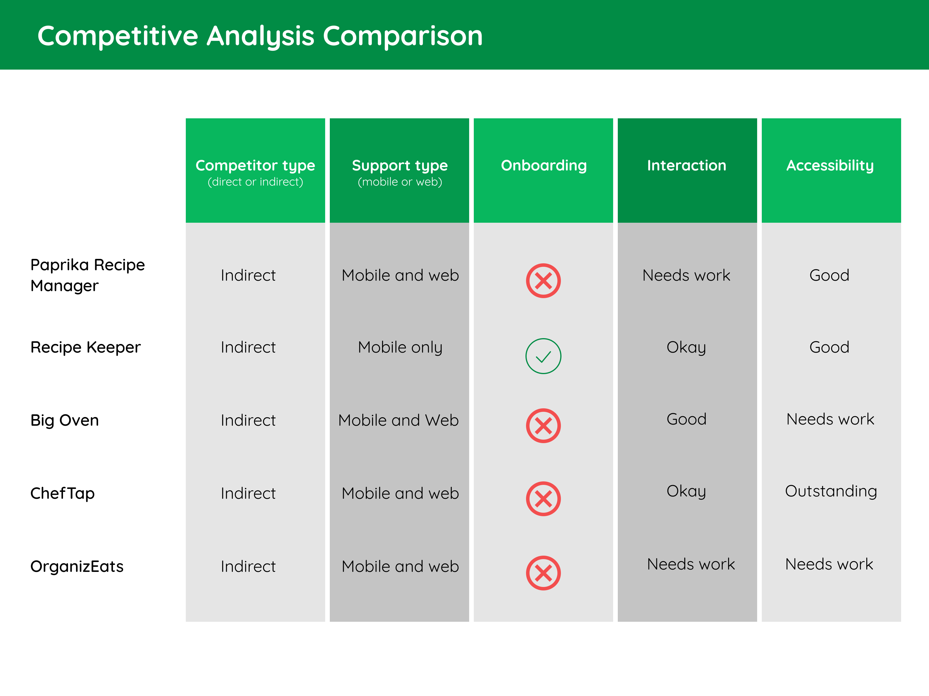
After carefully studying several potential competing recipe apps,
and although none compete directly with La Ciotola’s, they can still infringe on the
app’s popularity. Comparing competitors, the majority of the features were similar;
however, there are few gaps that could be filled.
For the complete competitive audit, click here.
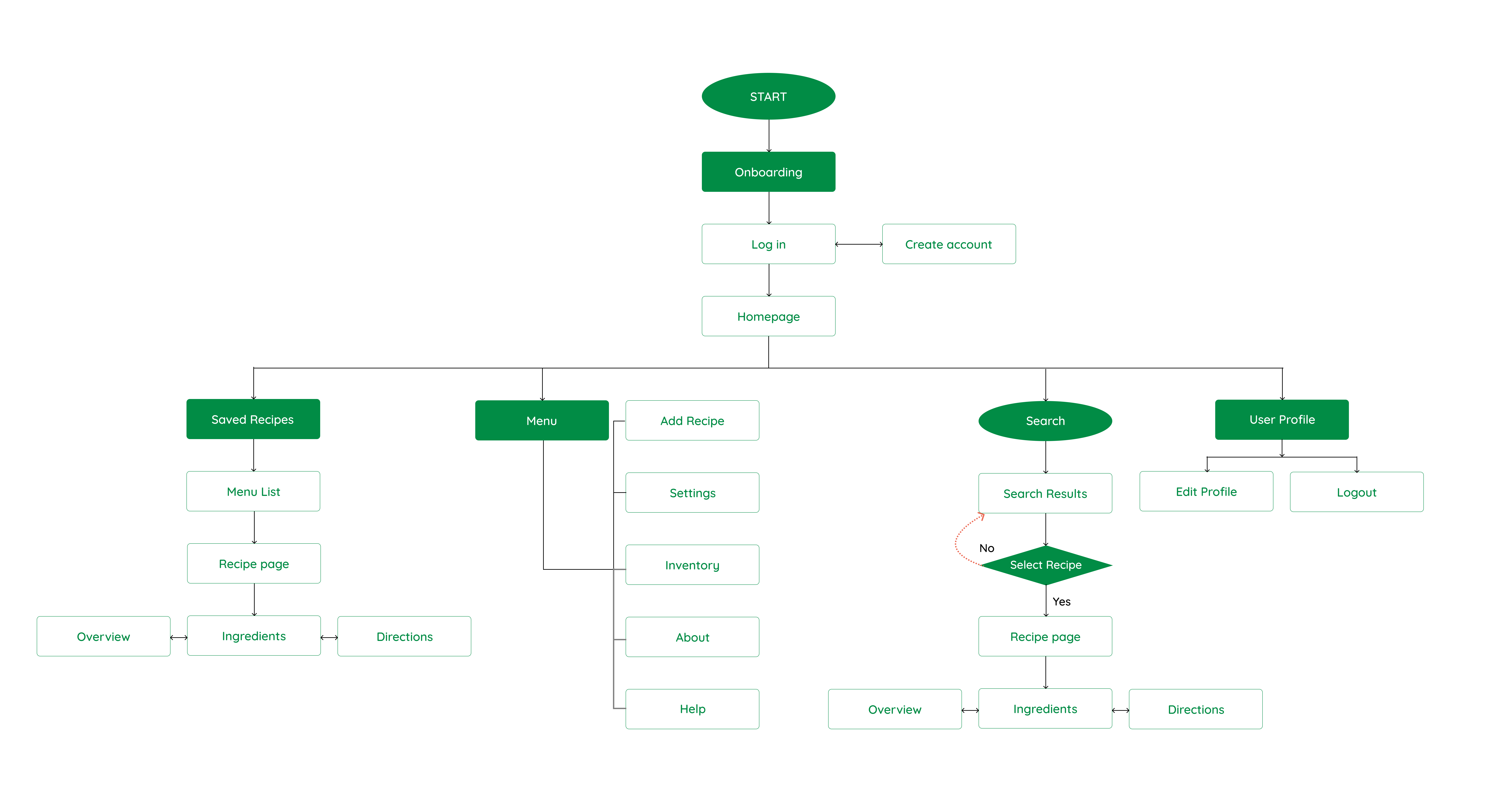
With the user flow in mind, I created an Information Architecture of what a basic start to finish journey looks like while trying to access recipe page. This helps in understanding ways users can interact with the product, as well as enabling to see navigation through user goals.
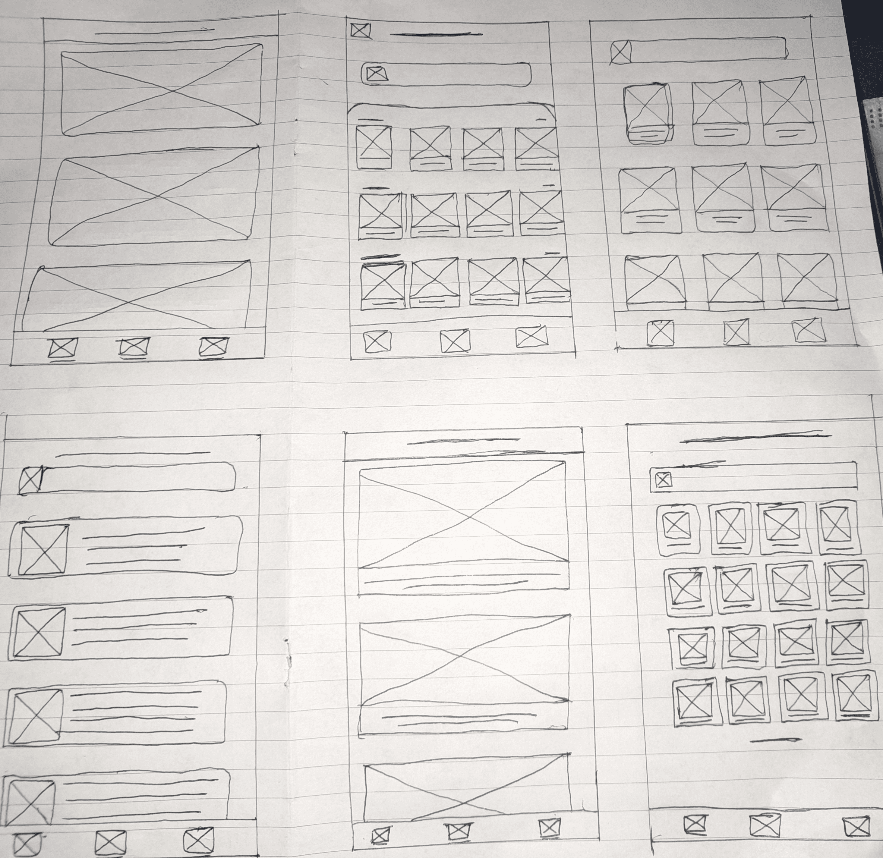
Taking the time to draft iterations of each screen of the app on paper ensured that the elements that made it to digital wireframes would be well-suited to address user pain points. For the home screen, I prioritized an layout that is easy to use and understand to aid a smooth navigation experience.
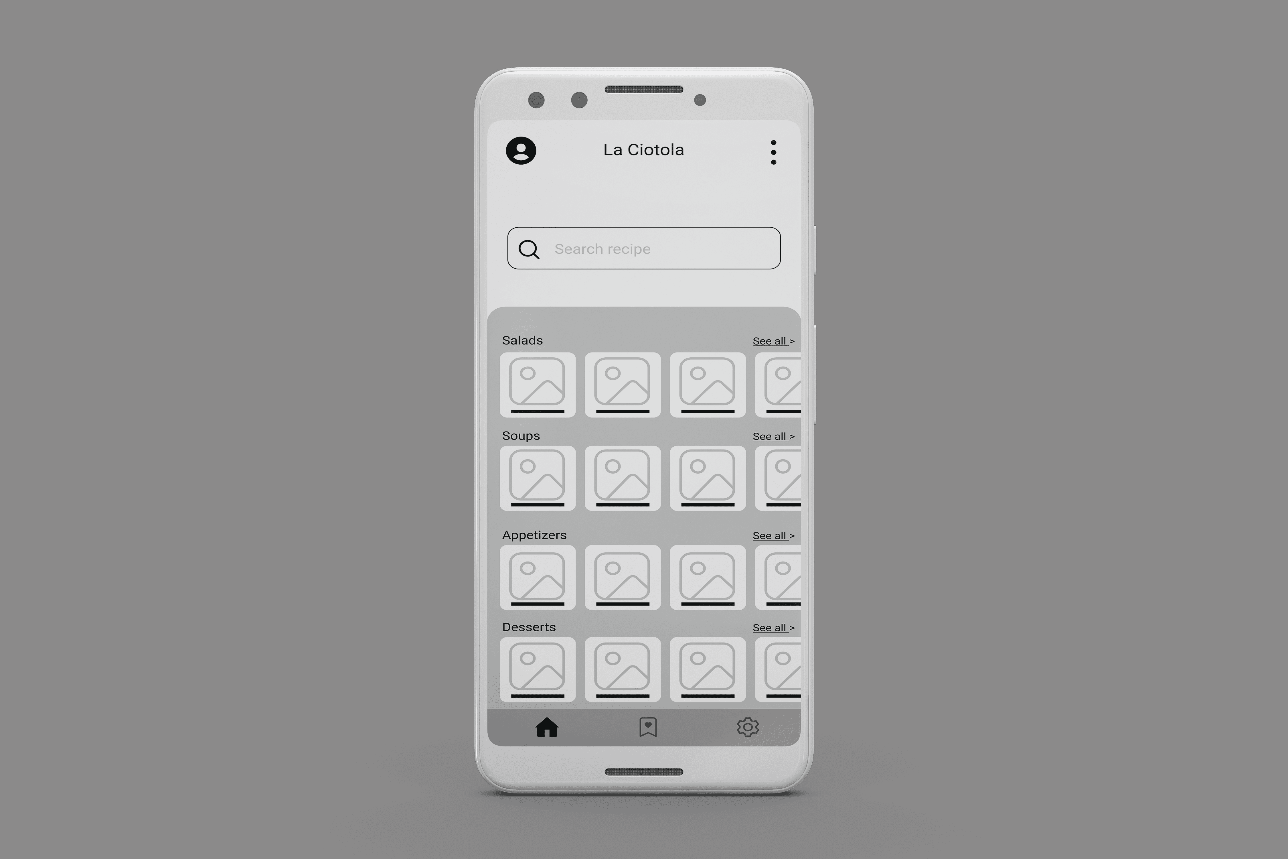
As the initial design phase continued, I selected a user-friendly sketch and created a low fidelity wireframe of some of the screens.
After creating the prototype from low fidelity wireframes, I asked six different participants (two people from the initial interview) to run through different scenarios in the prototype in hopes of garnering enough feedback to use for the next set of design iterations. I conducted two rounds of moderated usability studies. Findings from the first study helped guide the designs from wireframes to mockups.

I opted for an unmoderated usability test for the first round of the
usability test
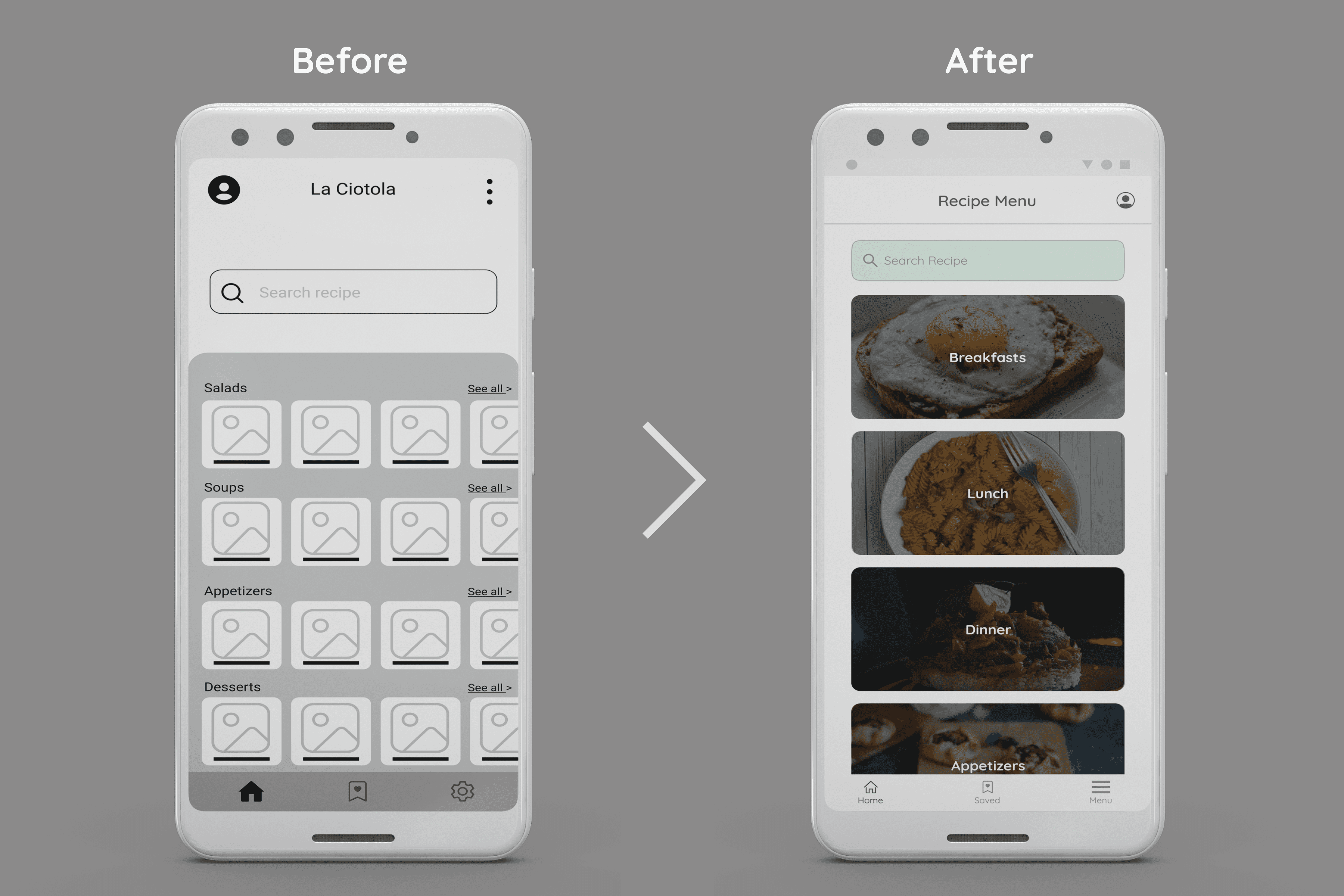
Taking into account feedback from the first usability, I made required changes in preparation for
the second study which involved a high-fidelity prototype and revealed what aspects of the mockups needed refining.
I opted for a moderated usability test to properly understand how users will use the app

I made the required changes like adding time-synced text that adjusts while the audio assistant reads the text. I also added function buttons to increase/decrease the audio speed and others.
I created a mood board for inspiration; for creating the mood board,
I opted for a creative, warm, harmonious, and playful theme while maintaining an
easy-to-read interface.

I started my Hi-Fi design by creating a style guide to ease the iteration level in the app design;
for my design, I chose color green. The color represents growth and stability.
It came from wanting to express the feeling of harmony in the kitchen to users.
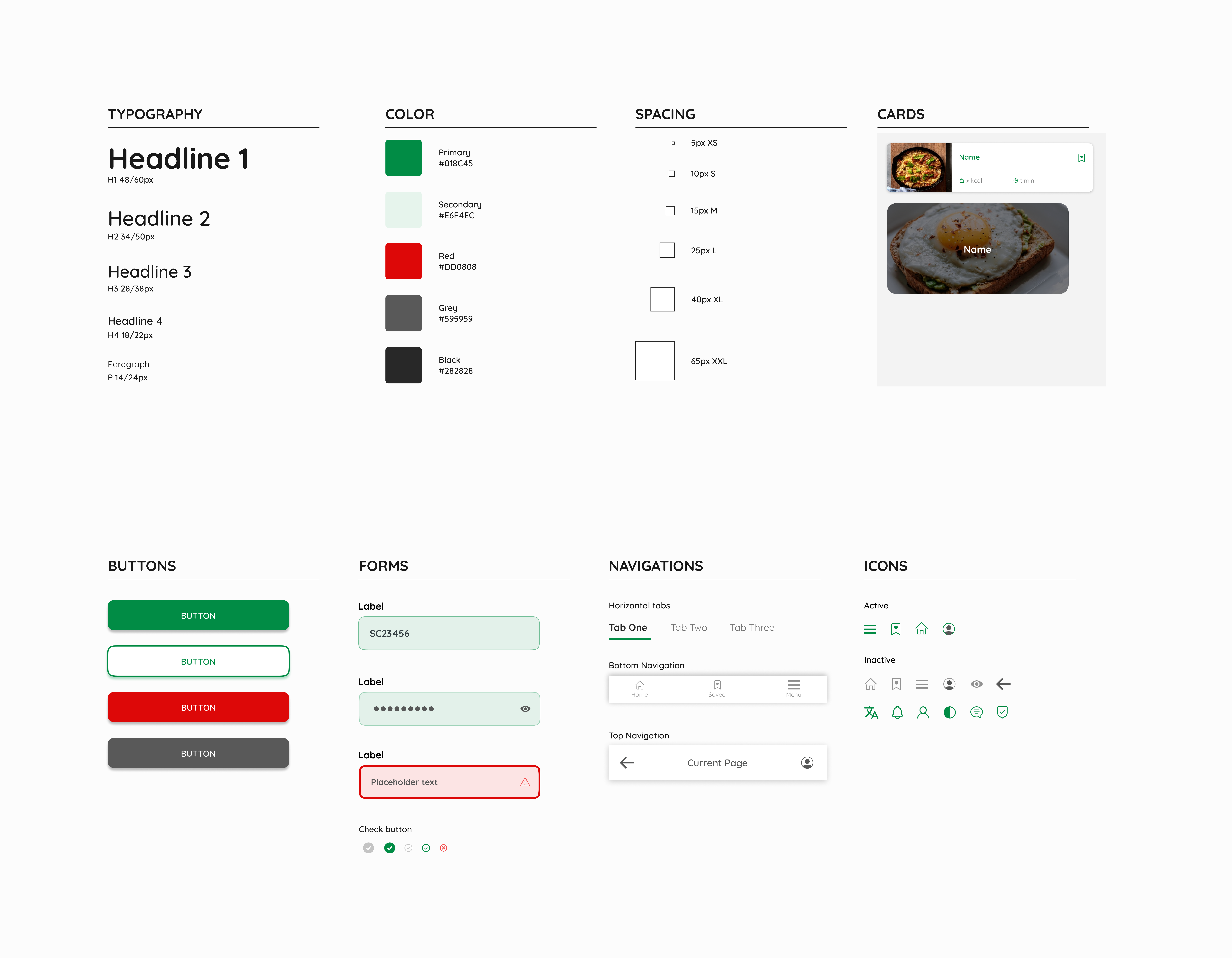
The final high-fidelity prototype presented tidier and more straightforward user flows for accessing the recipe and using the audio assistant. It also meets user needs to customize ingredients to suit the meal per serving size ratio.

My design took into account some accessibility factors in order to maintain a great user experience
The app makes users feel like their needs are being met,
and they can cook in a stress-free environment and learn new recipes on the go.
One quote from peer feedback:
“The app looks like something I will want to use while I cook; it’s easy and straightforward.”
The full prototype is available here
and you can find the full details behind my process here
Even though this isn’t a live project, I had fun while designing the app, and I learned that the first ideas are only the beginning of the process. Usability studies and peer feedback influenced each iteration of the app’s designs.
It was a great learning experience for me.