CASE STUDIES
ABOUT


CASE STUDY


uVote App:
An Electronic Solution to Election Problems

RESEARCH / UI DESIGN / WIREFRAMING / PROTOTYPIING


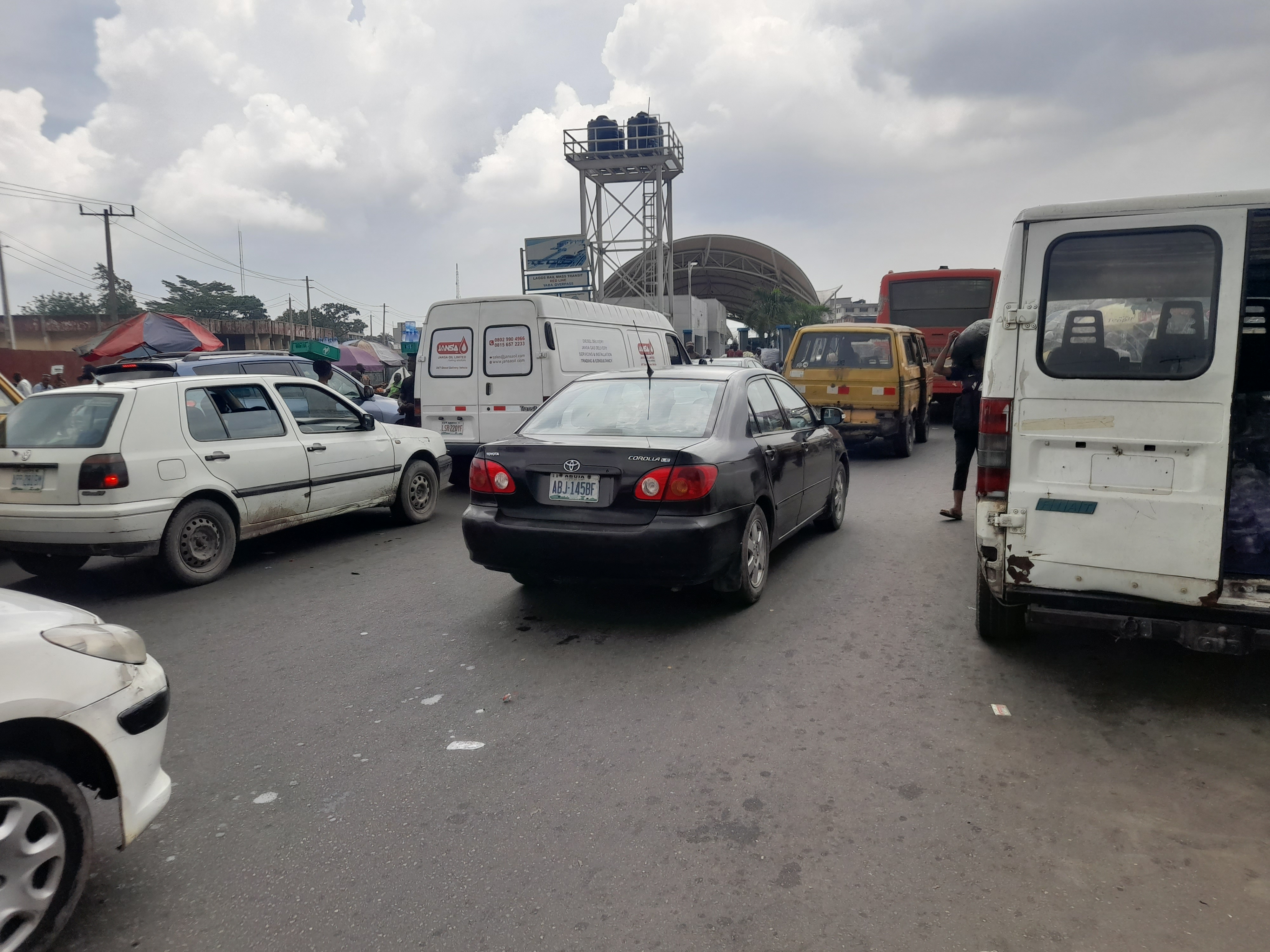
The year is 2022, and Nigeria’s situation has deteriorated across all sectors. In the aftermath of several corrupt elections, citizens have become hesitant to trust the electoral process. The challenge is to develop a digital solution that allows citizens vote with ease and ensure electoral transparency.

My idea is to design a mobile application and a responsive website that feature an easy registration procedure, full information on candidates and their campaigns, election news, a simplified voting process, as well as a live overview of online voting statistics.

Try the prototype


Role and Duration


Led the app and responsive website design from conception to delivery.
Conducted research and interviews, created paper and digital wireframes, low and high-fidelity prototypes, conducted usability studies, accounted for accessibility, iterated on designs, determined information architecture, and designed final layouts.


February 2022 — March 2022 (5 weeks)


Overview


The registration process leading to an election should be easy and accessible to every legible citizen both at home and abroad. The legitimacy of the electoral process is compromised because of severe electoral fraud, corruption, and unfair practices. Consequently, they threaten democracy. An election is rendered meaningless where there has been significant inefficiency or blatant cheating on the part of the administrators. uVote is a Nigerian-based electronic voting application to reduce the stress and corruption around election registration and the voting process. uVote’s primary target users include concerned youths who are worried about how the election has been handled and would like to see some changes.


Research


According to Statista, in 2019, Nigeria’s population was estimated to be at around 206.1 million, and 52.712% of the population were estimated to be between the ages of 18 and 84; that’s about 108.6 million people in the active voting age bracket.

In the 2019 election, INEC (the national electoral body) reported the total number of registered voters to be 84,004,084. That’s about 77.3% of people in the active voting bracket; but only 26,726,836 votes (31.8% of the registered voters) were recorded at the presidential elections.

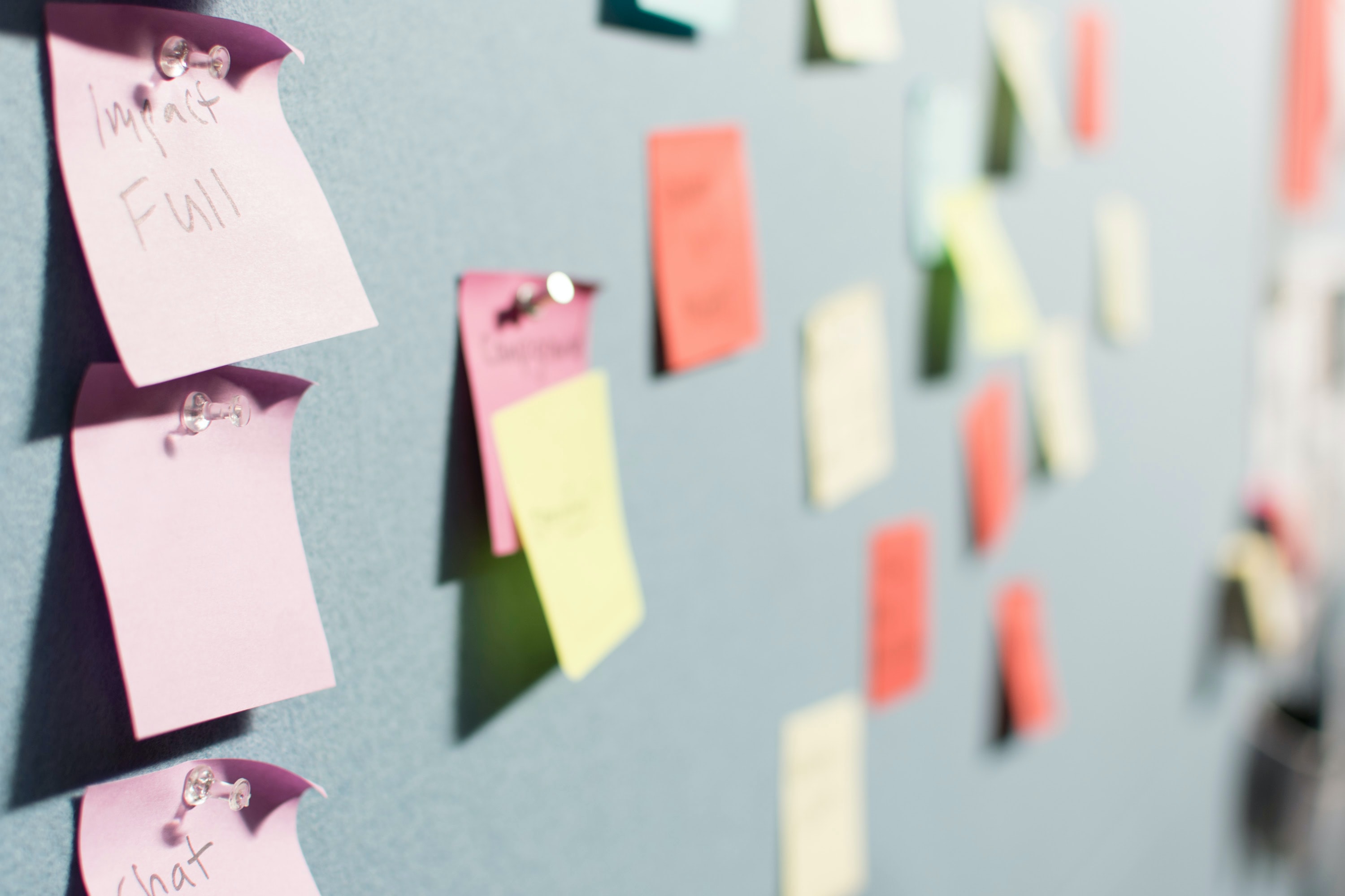
To further understand the reason behind the low turnout for the elections, I went out to interview people. The target of these interviews were the millennials (26–41) and Gen X (42–57).


I met with people and asked them different questions. The questions were majorly based on their registration and participation in the past elections.


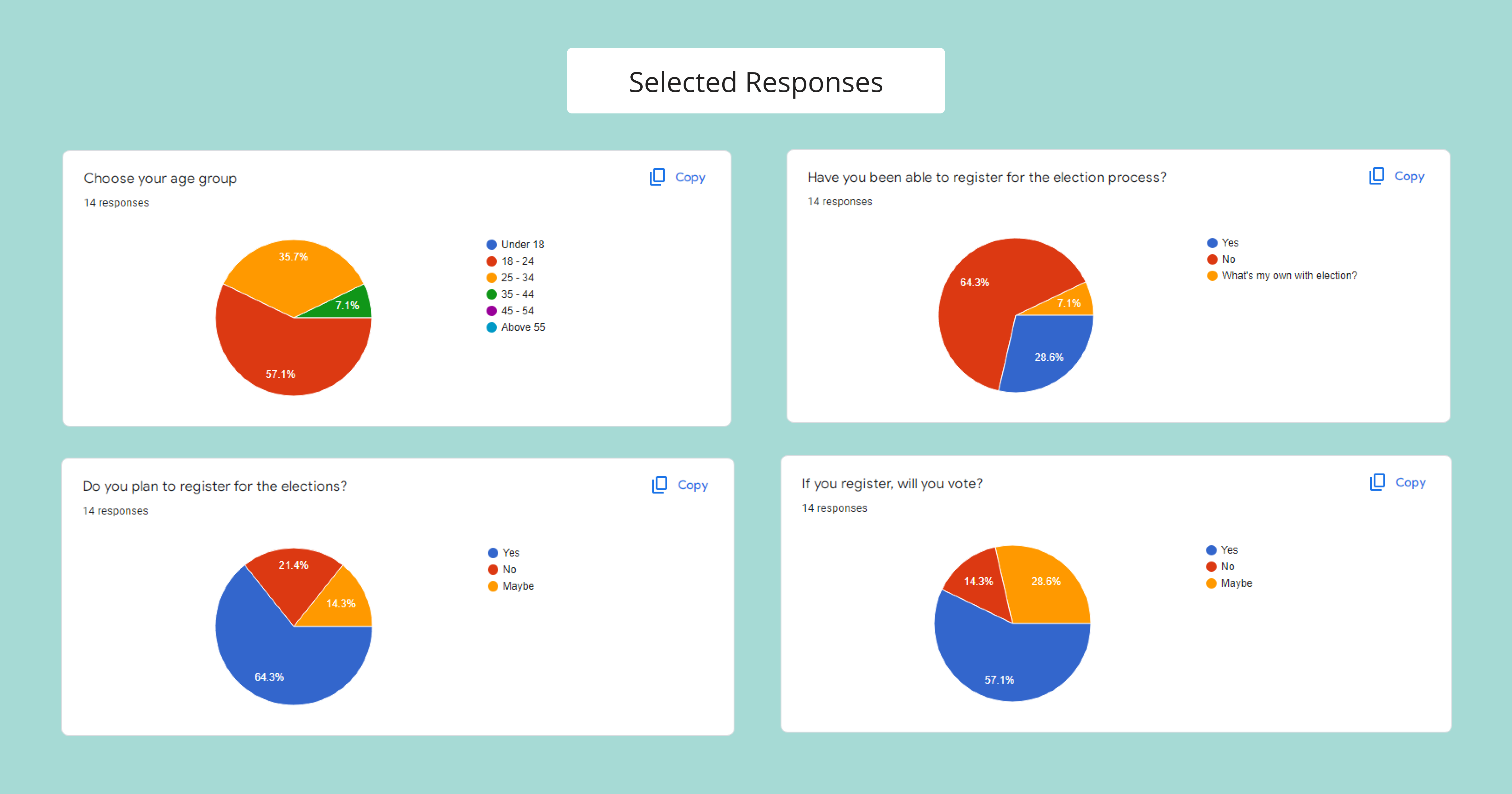
I further conducted quantitative research (survey via google forms) to understand another group of users. The Gen Z eligible to vote (18–25).


The insight from the survey shows that a lot of people from this survey group have not been able to register, and people who had been able to register had difficulties; here is a quote from one of the participants:


Data capturing was the bulk of the whole thing. I spent more than 7 hours waiting, it was either network issues, or there was no fuel in the generator. Although collecting my card took less than 2 hours for me.


Users


From my research, I was able to draw the following conclusions that the users of this app are the voters, and they can be categorized into different groups:


  • Millennials and Gen Z consisting of working professionals and students.
  • Older Generation (Gen X, Boomers)- these are the senior citizens.
  • People who cannot make it to the polls, citizens abroad who want to participate, the disabled and infirm.


Solution Process


Knowing who I was designing for helped me consider how the app should fit into their lives.

Considering that it is expected that most users will use the application via mobile phones, I chose the Progressive Enhancement design approach, and I began by designing the mobile application.

Along with bringing political transparency and making the election process appealing to the youth, the app will also fulfill the following needs:

  • Make voting possible from anywhere for a large number of voters.
  • Quickly register and cast a vote with less time and effort.
  • An innovative idea to ensure that the disabled and infirm can participate, a move that will result in thousands of additional voters.
  • Provide an alternative method to improve accessibility, security, and resilience to those who have difficulty voting due to various circumstances.
  • The use of blockchain technology, the technology that powers Bitcoin, could be used to alleviate security concerns.


Wireframes


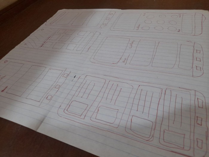
I established the idea for the overall structure of the user experience by using Pen and Paper. Using the “How Might We” method, I sketched out different page designs and was able to iterate quickly on which was best for the users.


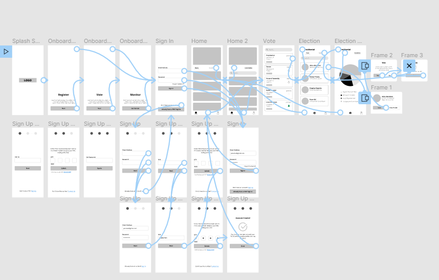
Following my sketches and storyboard, I had several ideas regarding the design of the UI and its functional and interactive elements. What began as a vague idea developed into something concrete. With this, I was able to create digital wireframes.


Usability Test


In preparation for usability testing, I created a low-fidelity prototype illustrating the app design’s major features.


I opted for an unmoderated usability test because I wanted the participants to feel relaxed and in their natural state while using the app, six participants were asked to send feedback on each task completed.

The tasks includes:

  • Registering on the app.
  • Checking a candidate’s profile.
  • Voting for a candidate.
  • Checking the statistics of on-going and concluded elections.

The feedbacks were positive; however, there were improvements opportunities such as the addition of a search bar on the candidate’s overview page, the addition of a vote button on a candidate’s profile page, and some other little details.


Mockups and Prototype


To maintain consistency across my designs, I outlined the essential components and building blocks (atoms, molecules, and organisms) of my design and created a sticker sheet and a style guide.

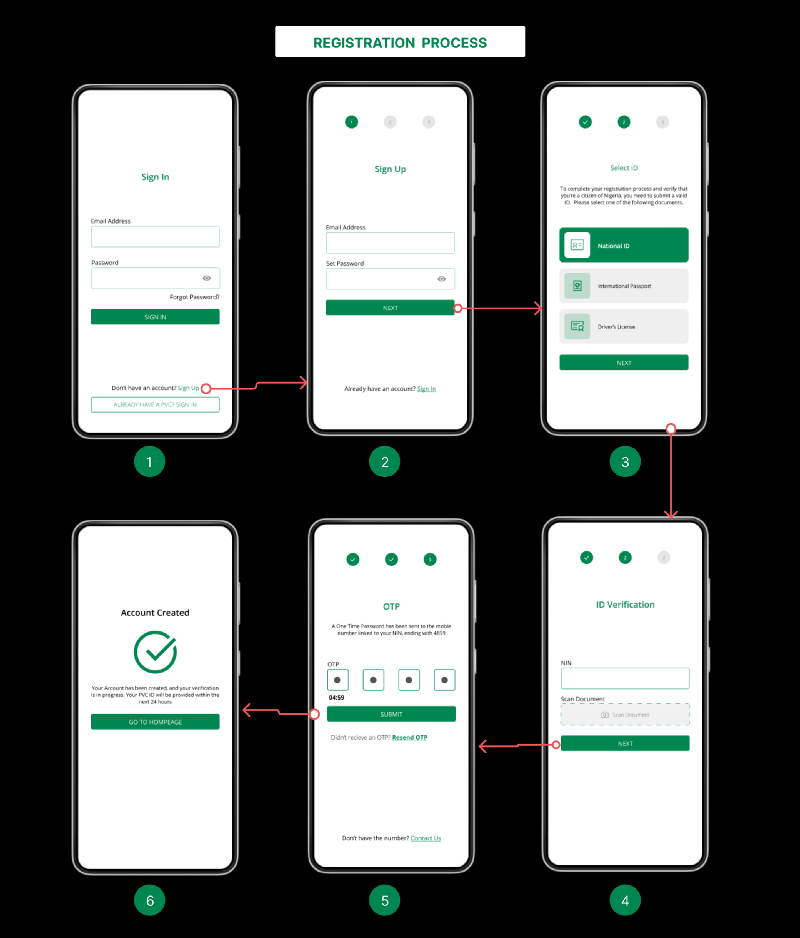
Historically, the registration process has been a headache for voters and prospective voters. Going through the same verification process again is not practical and wastes valuable time. I decided to leverage existing databases to streamline the registration process.

Considering some persuasion principles, I designed a multi-step form to reduce the user’s cognitive load by separating the steps to reduce friction points that might stop them from completing the registration process.


The app includes other features:

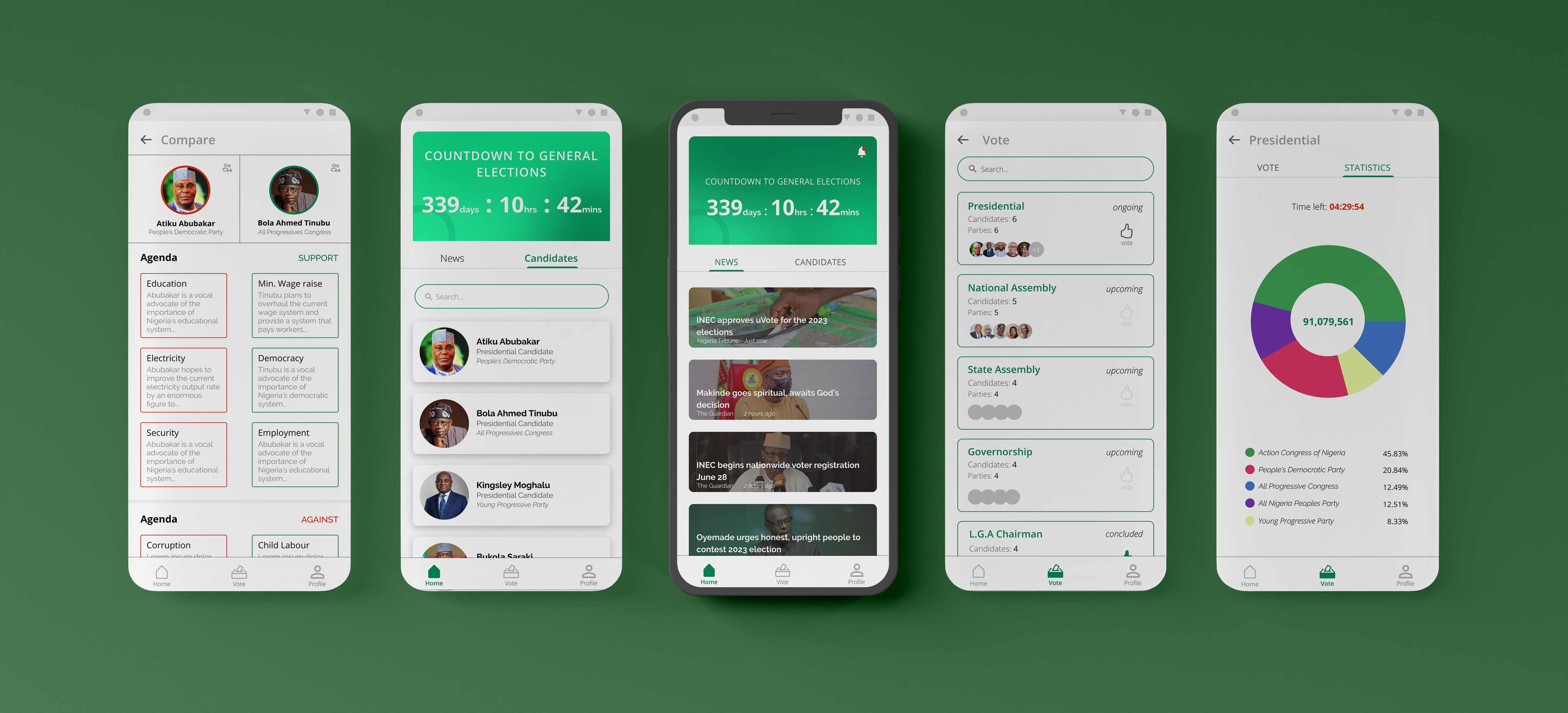
  • To remind voters when the general elections will take place, I added a countdown timer on the home screen. This screen also displays election-related news headlines. You can access the content using an in-app browser to access the news website.
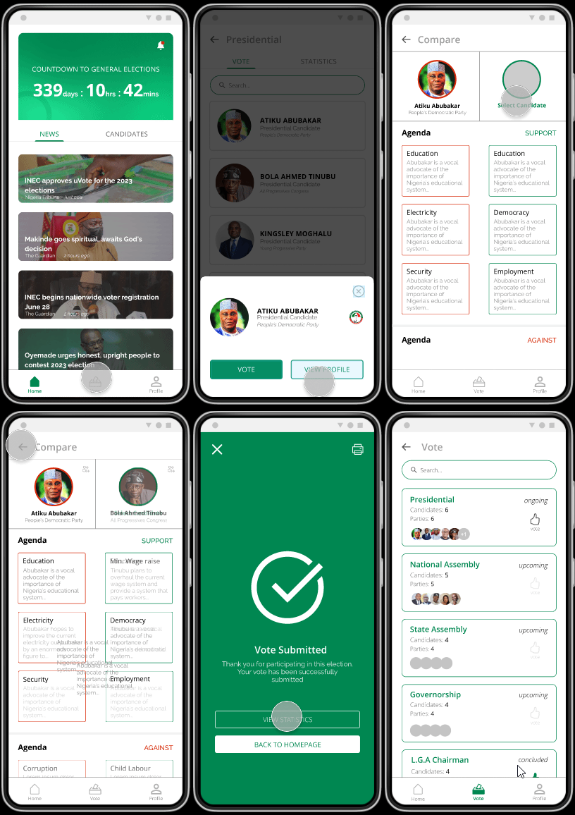
  • All candidates (not aspirants) are listed on the candidates’ overview page, and each candidate’s page contains information about them, including their agendas. Users can compare two different politicians and get insight into their views and positions on various agendas for better decision-making.
  • The vote page has each election grouped by offices, and each candidate’s card is available in their contesting office. In each office section, there’s a detail of their statistics(if it’s an ongoing or concluded election).
  • The voting procedure is a two-step process, with a confirmation dialog to eliminate errors by mistakenly clicking on the wrong candidate.


You can try the prototype


Responsive Web Design


With the mobile app designs concluded, I started work on designing the responsive website. I designed the web pages with a minimal style. This was to keep users focused on the goal as well as to reduce cognitive load and maintain a faster website loading rate.


Accessibility Considerations


My objective was to design the application so that everyone could use it, regardless of their current circumstances, so that it could reach the largest audience possible. In doing this, I took in some accessibility considerations:

  • Clear labels for interactive elements that screen readers can read.
  • Choosing a color scheme that passes the accessibility color checker.
  • Settings consideration for font size change.
  • Dark mode feature for users with low vision and light sensitivity.


Takeaways

Impact

As of 2021, according to Statista, it was estimated that there are over 101 million mobile internet users in Nigeria, which means uVote has the potential to increase voter participation by at least 80 percent.

I introduced the prototype to prospective users, and users shared that the app made registering for elections seem like something that was both achievable and easy. In peer feedback, peers described uVote as a platform that can help them understand candidates better and smooth out the voting process.


What I learned

I learned that even though the problem I was trying to solve was significant and somewhat tricky, diligently following through each step of the design process and aligning with specific user needs helped me come up with feasible and useful solutions.

It was a stimulating and enlightening experience for me.

The full prototype is available here and you can find the full details behind my process here


“Life is a series of problem-solving opportunities. The problems you face will either defeat you or develop you depending on how you respond to them.”
— Rick Warren